

How To Optimize Your Lead Magnet For Conversions
My Weekly "Money Date" Routine As A Small Business Owner
How To Plan Your Week According To Planetary Correspondences
Copywriting
Money chat
Productivity
3 Common Opt-In Page Mistakes Course Creators Make
5 Lead Magnet Ideas For Course Creators (That Work In 2025)
Launch strategy
Should you invest in building a quiz for your audience? Or hit "Record" on a private podcast?


The meeting place of strategy & magic
Because sometimes you need to know how to write a launch email sequence... And sometimes you need a Tarot spread to help you get through the mid-launch blues.
WELCOME TO THE SANCTUARY BLOG
“Hey, Ieva–I need a DIY-friendly webinar confirmation email template for my next online course launch. Can you help?”
Sure thing, boo.
Not only will I give you a simple, plug-and-play template you can use for any webinar sales funnel you build…
I’ll also share some essential tips & tricks for making it your own–including multiple subject line ideas (with examples!) for you to try out.

Let’s get to it, shall we? ⬇️
Wait, What’s A Webinar Confirmation Email?
A webinar confirmation email gets sent to everyone who signs up for your live event immediately after registration.
✅ This email typically aims to accomplish three things:
- Confirm their registration (“Yay, you did the thing!”)
- Remind them of the logistics (date, time, join link)
- Build anticipation for what’s to come (and why they should actually show up)
Webinar confirmation emails are a key part of many famous digital product launch formats, including those taught in Amy Porterfield’s Digital Course Academy and Jeff Walker’s Product Launch Formula.
While most online course creators view these emails as nothing more than a formality…
With a few simple tweaks, you can turn them into powerful touchpoints that make your audience feel like they’re a part of something special.
3 Essential Elements of A Webinar Confirmation Email
I’m going to share the webinar confirmation template with you in just a sec.
But, before I hand it over…
Let’s break down the key elements of a great webinar confirmation email, okay?
This will help you make the template your own (and ensure you don’t sound like every other person who happened to stumble upon this blog post). 😉
Element #1: Logistics
Let’s start with the non-negotiables.
These are the must-have details you need to include in every single webinar confirmation email you send (yes, even the really clever ones):
- Date & time of the webinar (bonus points for multiple time zones)
- How long you expect it to go (so that people can plan for it properly)
- A link to join the event live (easy to spot & click when the time comes)
These are the bare essentials, okay?
💖 If you want to go the extra mile, here are some nice-to-have additions (that still fall under the “logistics” umbrella):
Add To Calendar Link: You can use a tool like AddEvent (aff) to generate a universal calendar link that will automatically adjust the time zone and add your event to their calendar.
(If that feels like too much to figure out right now, you can simply share a link to a time zone converter like this one.)
What to bring: Let them know if there’s anything you want them to bring to the session. A notebook? A worksheet? Just their fabulous self?
Pre-work information: Is there anything you want your people to watch/read/complete before attending? Include all relevant links (e.g., worksheet access) here.
Replay information: Will there be a replay? (Psst: 63% of webinar views come from replays… So there really should be one.) How soon can they expect it to hit their inbox?
Tech troubleshooting tips: For the less tech-savvy folks in your audience, consider adding a quick “what to do if Zoom won’t open” note (+ a link to troubleshooting steps).
Here’s an example:
Element #2: Vibe check
Your webinar confirmation email is a great opportunity for you to set the mood, tease what’s coming, and get people excited to show up.
Here are a few fun ways to do that:
- Curate a Spotify playlist to match the theme of your webinar
- Make a Pinterest moodboard to visualize the energy you’re going for
- Share a Tarot card pull alongside your intentions for the group
(Want more ideas like this, tailored to *your* audience? One of my 60-minute Sounding Board Sessions might be right up your alley.)
The easiest place to include this “vibe check”?
✏️ The P.S. Section of your email, of course.
Here’s an example:
Element #3: A simple ask
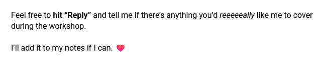
One of the most powerful things you can do in your webinar confirmation email is to invite your audience to co-create the event with you.
At its simplest, this could look like asking them to send in questions ahead of time (so that you can tailor your presentation to their needs).
Here’s an example:
If you want to get a little fancier with it, try to think of a practical, hands-on way to involve your audience in the workshop-building process.
💡 Here are a few examples:
If you’re a sales page copywriter:
Ask your audience to send in their existing sales page draft for you to review.
You can do a live copy review on the call or simply use the drafts to shape the direction of your presentation.
If you’re an astrologer:
Ask your audience to share their birth chart with you if they want to be chosen as the case study for your workshop.
(Note: This is sensitive info, so don’t forget to get all the consent stuff sorted out.)
If you’re a breathwork teacher:
Ask your audience to tell you about the last time they felt stressed–then create a mini breathwork practice based on the most popular themes you see in their responses.
Webinar Confirmation Email Template for Online Course Creators
Alright, let’s get to the good stuff now.
Here’s a DIY-friendly webinar confirmation email template you can use to build more anticipation for your upcoming event:
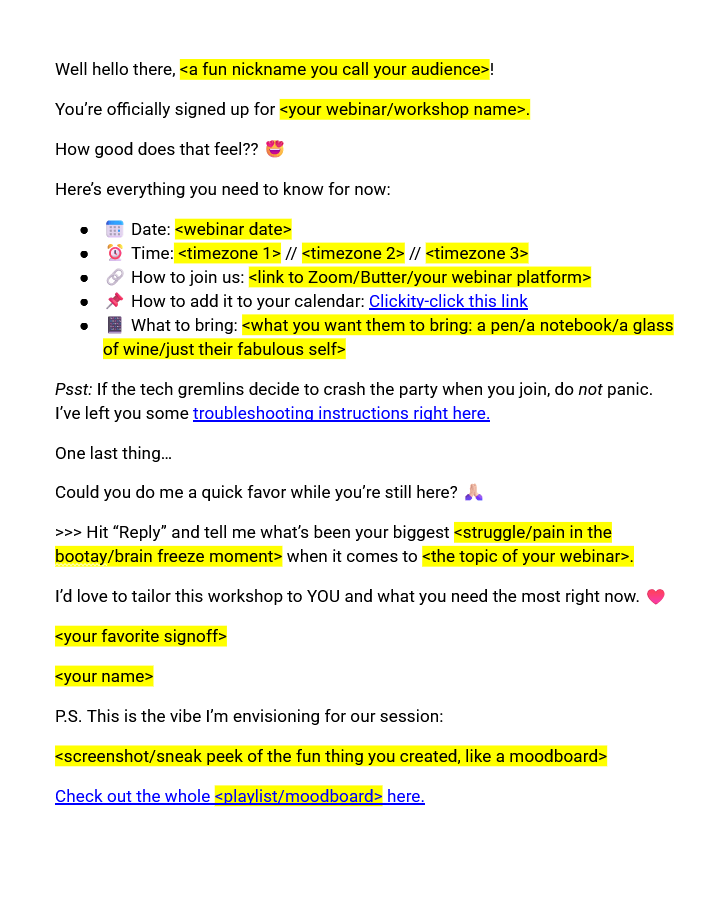
And here’s a version of a template you can copy-and-paste straight into your launch email Google Doc:
Well hello there, <a fun nickname you call your audience>!
You’re officially signed up for <your webinar/workshop name>.
How good does that feel?? 😍
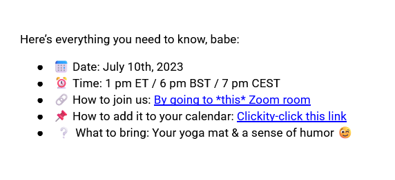
Here’s everything you need to know for now:
- 📅 Date: <webinar date>
- ⏰ Time: <timezone 1> // <timezone 2> // <timezone 3>
- 🔗 How to join us: <link to Zoom/Butter/your webinar platform>
- 📌 How to add it to your calendar: Clickity-click this link
- 📔 What to bring: <what you want them to bring: a pen/a notebook/a glass of wine/just their fabulous self>
Psst: If the tech gremlins decide to crash the party when you join, do not panic. I’ve left you some troubleshooting instructions right here.
Oh, and one last thing…
Could you do me a quick favor while you’re still here? 🙏🏻
>>> Hit “Reply” and tell me what’s been your biggest <struggle/pain in the bootay/brain freeze moment> when it comes to <the topic of your webinar>.
I’d love to tailor this workshop to YOU and what you need the most right now. ♥️
<your favorite signoff>
<your name>
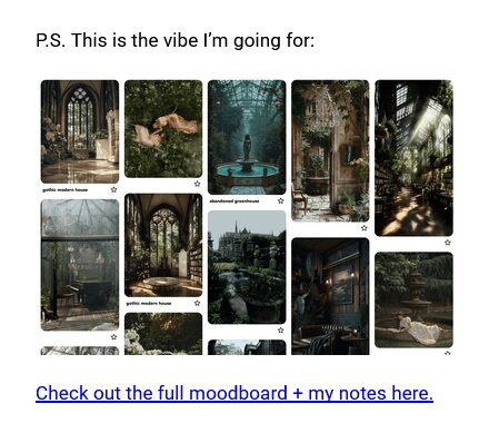
P.S. This is the vibe I’m envisioning for our session:
<screenshot/sneak peek of the fun thing you created, like a moodboard>
Check out the whole <playlist/moodboard> here.
Note: While we could definitely get fancier with it (and I often will when working 1:1 with my copywriting clients), this webinar confirmation template is a great starting point for any DIY-er out there.
Webinar Confirmation Email Subject Line Template (+ Examples)
Your webinar confirmation email subject line needs to do three things:
- Confirm their registration
- Build excitement for the event
- Make your email easy to find in their inbox
As such, your webinar confirmation email subject line will typically follow a formula like this:
a version of “you’re in!” + your event name + an on-brand emoji
You can then use the Preview text to either:
- Remind people why they should come, or
- Ask them to open the email to see their next steps
Here are some subject line examples:
Subject line: [you’re in!] Retrograde Ready 🪐
Preview text: let’s make the planets work for you
—
Subject line: YOU’RE IN! Your Disco Therapy session awaits 🕺🏻
Preview text: the dance class you didn’t know you needed
—
Subject line: You’re in! From Chaos To Calm 💆🏻♀️
Preview text: open up for your next steps
Keep your subject lines under 50 characters & make sure you prioritize clarity over cleverness.
We can’t have your future customer digging through their entire inbox to find your webinar confirmation email, can we?
What Email Marketing Software Should I Use For My Webinar Emails?
If you haven’t chosen an email marketing platform yet (or just haven’t landed on one that really “fits”), I’d recommend giving Kit (formerly ConvertKit) (aff) a try.
After:
a) Spending 7+ years in the online business space, and
b) Seeing the behind-the-scenes workings of multiple 6+ figure businesses…
… Kit’s affordability + ease of use make it a no-brainer for me. 🤷🏻♀️
Grab yourself a free 14-day trial here. (aff)
Got More Qs About Webinar Emails?
Alright, and that’s a webinar confirmation email template for you!
Do let me know how it goes if you decide to try it out for your own launch.
If you’re keen to learn more, I’ve got a whole webinar email series for you to peruse:
- How to Write Your Webinar Invitation Emails
- How to Write Your Webinar Reminder Emails
- How to Write Your Webinar Follow-Up Emails
👋🏻 And if you’d rather hand off the whole email writing thing to someone who a) loves it, and b) is pretty dang good at it…
This sales funnel (*ahem* ecosystem 🌱) copywriter would love to help.
“Hey, Ieva: how do I write a webinar reminder email that actually gets people to show up live (instead of catching the replay)?”
That’s the big question, isn’t it?
While a low webinar attendance rate doesn’t necessarily equal a failed launch, our final revenue numbers do tend to look better when more people show up live. 🤷🏻♀️
What Is A Webinar Reminder Email?
Their main purpose of webinar reminder emails (also called “webinar show-up emails”) is to make sure that your registrants actually show up to the live version of your event.
(You’ll also want to send out some webinar follow-up emails to encourage people to watch the replay, of course.)
Usually, you will only send webinar reminder emails to the people who have already said “yes” to the webinar, although it’s not unheard of to let one slip through to your whole email list.
✅ Webinar reminder emails typically feature:
- A recap of the event details (what, when, where, etc.)
- A link to join your presentation
- At least one compelling reason to show up live (e.g., a bonus resource that won’t be available to the replay-watchers)
Webinar reminder emails are a core feature of many popular digital product launch strategies, including those taught in Amy Porterfield’s Digital Course Academy and Jeff Walker’s Product Launch Formula.
Why Is Live Webinar Attendance So Important?
Even though webinar replays account for 63% of their total views, we typically tend to see higher conversions from people who show up live.
Why?
Well, for one, seeing other attendees in the live chat creates a sense of community and momentum that can’t be replicated during a replay.
👏🏻 When someone sees other people engaging with your webinar (asking questions, participating in polls, etc.), it encourages them to do the same.
These interactions build emotional investment–not just in your content, but in you as a teacher.
Plus, nothing builds the “know, like, trust” factor faster than watching someone completely fumble their screenshare attempts and still deliver value like a pro. 😀
(I’m kidding. Mostly.)
How to Write Your Webinar Reminder Email(s)
Tip #1: Nail your subject line
This is not the time to be cute with your subject lines.
Okay, fine, maybe you can be a little cute.
But only after you’ve made it extremely clear that there is a “I’ll kick myself if I miss this” event starting soon.
Here’s an example of a “meh” subject line:

And here’s an example of one that gets my stamp of approval:
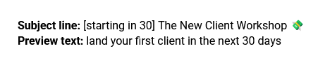
While the first subject line could be talking about literally anything…
The second one makes it clear that something awesome is happening in 1 hour.
The preview text then builds on the subject line by teasing the transformation of the workshop and reminding the reader why they signed up in the first place.
💸 And the emoji? Not essential, of course, but a great way to draw the reader’s eye to your email regardless.
(I’ve included some more subject line ideas & examples in a section below–go check them out!)
Tip #2: Bring the right energy
Your webinar reminder email isn’t just a formality.
✨ It’s a vibe check for your entire event.
This is your chance to build anticipation and remind people WHY they love learning from you.
If you feel it, they’ll feel it.
So let your excitement show through your email copy.
Here are a few ways to do that:
- Play around with all caps (“IT’S TOMORROW, BABBBYYYY”)
- Use more exclamation points–kind of like you’re texting your BFF who’s flying into town later that day (“I can’t wait to see you!!!!”)
- Elongate your vowels to signal playfulness (“it’s gonna be good” → “it’s gonna be gooooooood”)
- Add an extra emoji or two, just for fun 🎉🔥💻✨
- Turn yourself into a celebratory GIF (or choose one from your favorite TV show)
Now, this doesn’t mean you need to scream and shout if you’re brand voice is typically more low-key.
Even a simple “Can’t wait to see you” with a heart emoji ♥️ or a happy GIF can go a long way here.
Tip #3: Show you behind-the-scenes prep
Consider this the “show, don’t tell” version of my point above.
One of the best ways to showcase your excitement and generate more buzz for your event is to pull back the curtain and show people what you’re doing to prep for the event behind the scenes.
🎨 This could be:
- A sneaky screenshot of your webinar slide deck
- A picture of your post-it-covered Wall Of Awesome Workshop Ideas
- A photo of your desk covered in workshop notes and general prep chaos
I’ve even seen people making aesthetic moodboards to capture the vibe of their event. (My Pinterest-loving heart adores that.)
Bottom line:
Show them it’s all real. Show them you’re excited. And let the anticipation build.
Tip #4: Make “live” feel special
💡 You need to give your audience a reason to show up live–without (!) making your replay-watchers feel like they’ve been left out in the cold.
(^^ This is important. Think about that for a moment.)
Your reason could be:
- A live-only bonus resource (everyone gets the main workbook–but only live attendees get an extra checklist they can import into Asana)
- A live-only discount to your program (everyone gets a $250 discount until Monday–but live attendees unlock another $100 off)
- An opportunity to participate in hot-seat coaching (everyone gets to learn from you–but only live attendees get the personalized feedback)
Here’s an example:

By spotlighting these live-exclusive rewards in your webinar replay email, you might just turn “ehh, I’ll catch the replay on Saturday” into “Mark, you’ll need to watch the kids on Friday–I’ve got places to be.”
Tip #5: Don’t forget the webinar details
Alright, we’ve covered the fun stuff–your energy, your excitement, all the behind-the-scenes magic–but let’s not forget about the actual logistics, okay?
There’s nothing that kills momentum faster than someone going: “Wait… Where’s the Zoom link again?”
Save your attendees the confusion by making your webinar details super clear and easy to find.
Here’s a simple template you can swipe:
📅 Date: <your webinar date>
⏰ Time: <your webinar time in 3 different time zones>
💻 Where: On <Zoom/Butter/your favorite webinar platform>
🔗 Join Link: <your join link>
📝 What to Bring: <what you want them to bring>
And here’s an even simpler example of it in action:

Tip #6: Add a P.S. reminder
Sure, we’ve already sold them on the value of your presentation in your webinar invitation emails…
But a little last-minute persuasion never hurts.
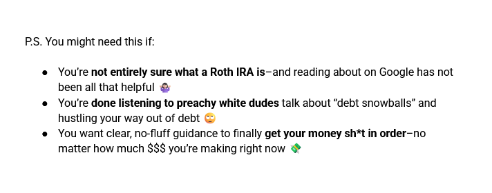
➡️ Use the P.S. section of your reminder email to remind them why they chose to sign up for your webinar in the first place.
Here’s a simple bullet-point template you can use:
P.S. You might need this if:
- <thing they struggle with>
- <thing they’ve tried unsuccessfully>
- <thing they really want>
Here’s an example:
Or, if you’d like to keep it simple, just say:
P.S. I’ll be sharing <how to achieve the outcome they want> during tomorrow’s workshop. Wanna come?
Tip #7: Ask them to hit “Reply”
Encourage your audience to reply to your webinar reminder email.
Some questions you can ask them:
- What’s one thing you’re hoping I’ll cover in this webinar?
- What’s one thing that makes you NOT want to attend events like these? (I’ll see if I can do better.)
- Are you planning on joining live or catching the replay? (No pressure either way, I just love to know who’s coming.)
🍄 Even the tiniest micro-committment–like hitting “Reply” to an email–can make people more invested in showing up.
Getting them involved in the webinar planning process (“What do YOU want me to cover?”) can increase their emotional investment even further.
(Psst: You can use Kit’s new poll feature to make this step even easier.)
Webinar Reminder Email Subject Line Examples
Webinar reminder subject lines typically adhere to the following formula:
[how much time left] + a version of “you coming?” + an on-brand emoji
I’ll usually use the Preview text to remind the reader of:
- Their main struggle or desire
- The live-only bonus or discount
Here are some subject line + preview text examples:
Very direct/time-focused:
Subject line: [30 minutes] Retrograde Ready LIVE 🪐
Preview text: “sooo… which planet is making me sad again??”
—
Subject line: You comin’? Room opens in 30 min. 🔑
Preview text: release your money blocks once and for all
More benefit-focused:
Subject line: [starting in 30] one idea today = one sale tomorrow 💸
Preview text: + free Voxer access if you join us live
—
Subject line: 30 minutes until your next money breakthrough
Preview text: join us live & get an extra 15% off
24-Hour Webinar Reminder Email Template
If you are just starting out and want to DIY your very first webinar show-up email, here is a simple 24-hour reminder email template you can follow:

Heyyyyyyyy <fun nickname you call your audience>!
TOMORROW. IS. THE. DAY. 👀
The <your workshop name> is finally happening.
And, judging by the state of my desk, it’s going to be a gooood one.
<a relatably-chaotic photo of your workstation/your workshop notes>
Here’s all the info you’ll need (just in case the email gremlins decided to hide your confirmation email):
📅 Date: <your webinar date>
⏰ Time: <your webinar time>
💻 Where: On <your favorite webinar platform>
🔗 Join Link: <your join link>
📝 What to Bring: <what you want them to bring, like their favorite bevvie, a notebook, or maybe just an open mind>
Yes, there will be a replay.
But the folks who show up live will get access to something extra special:
✨ <live bonus/discount details>
That said, whether or not you can make it live…
Feel free to hit “Reply” and tell me if there’s anything you’d reeeeeally like me to cover during the workshop.
I’ll add it to my notes if I can. ❤️
See you in our Zoom room,
<your name>
P.S. Still thinking about <outcome they want>? Join this Zoom room tomorrow, and I’ll help you make it happen.
How Many Webinar Show-Up Emails Should I Send?
I’m all about making the best of what you’ve got.
So if you’ve only got enough energy/time/spoons to write one webinar reminder email? That’s cool.
That said, in an ideal world, I would recommend sending anywhere between 3-10 reminder emails (yes, really).
Before you panic, these don’t all have to be super long or polished.
Each one can focus on a different angle, like:
- What you’ll cover (and what you won’t)
- Social proof from previous live events
- The juicy bonus that’s only available live
- A reminder of why they signed up in the first place
- The “omg, it’s happening in 5 minutes” countdown
The big names in the online course space will often follow an email cadence like this:
- 2 days before
- 1 day before
- 12 hours before
- 6 hours before
- 3 hours before
- 1 hour before
- 30-minutes before
- 15-minutes before
- 15-minutes AFTER the start
A more minimal (but still robust) schedule would look like:
- 1 day before
- 6 hours before
- 1 hour before
- 15-minutes before
- 15-minutes in
Know this:
It takes a heck of a lot of courage to send that many emails over the course of a single week.
✅ If it’s your first time running a live event like this, aim for 3-5 webinar reminder emails to start.
Then build up from there as your confidence increases.
More reminders = more people in the room = more sales.
And isn’t that what we’re here for?
What Email Marketing Software Should I Use?
If you’re still deciding which email marketing software to go with for your digital product business, my vote goes to Kit (formerly ConvertKit) (aff).
It’s affordable, easy-to-use and (in my experience) results in way fewer tech headaches than the alternatives (looking at you, AC).
Plus, it has everything you need to get your online course business to the much-coveted six-figure mark.
(Or are we talking about 8 & 9 figures now? Your girl can’t keep up.)
So if you happen to become the next Amy Porterfield… Kit’s got you covered. 😉
Grab yourself a free trial here (aff).
Where To Next?
If you’re actively working on your webinar email sequence, these two blog posts might be a good next step:
👋🏻 And if you’d simply like to hand all your webinar-email-writing tasks off to someone else? This course launch copywriter would love to help.
“Hey, Ieva: how do I write a webinar follow-up email that gets my people to a) watch the replay and b) enroll in my program?” 🤔
Great question, my online business friend.
A well-crafted webinar follow-up email can easily help you get more eyes on your webinar replay and turn around a slow-to-start launch.
It’s more than just a formality, and I’m glad you recognize that.
So let’s write one that gets those Stripe notifications rolling in, shall we?
What Is A Webinar Follow-Up Email?
A webinar follow-up email is a marketing email you send after wrapping up your webinar, presentation, or workshop.
✅ It typically features a replay of your presentation, as well as a call-to-action (e.g. book a call, fill out an application, buy my course).
It’s usually sent to two different groups of people:
- People who attended your webinar (but didn’t buy)
- People who registered for your webinar (but didn’t attend)
(Sometimes you will also send this email to subscribers who didn’t opt in to your webinar–but that’s a decision best made in tandem with your launch strategist.)
The main purpose of webinar follow-up emails?
Giving your people another chance to engage with your content while also (confidently & unapologetically) inviting them into your paid course or program.
Webinar follow-up emails are a key element in various popular digital product launch strategies, including those taught in Amy Porterfield’s Digital Course Academy and Jeff Walker’s Product Launch Formula.
Why You Should Give This Email More Love
Yes, sometimes you will sell out your entire program right there on the live call.
Other times, your audience will need a bit more time to say “yes” to your offer–and that’s a-okay.
That’s where the webinar follow-up email (and the rest of your launch email sequence) comes in.
This email is an opportunity for you to reconnect with the people who were interested in what you had to say, reinforce your core message, and remind them that yes, you do indeed have a solution to their problems.
❤️ So don’t sweat it if your launch is off to a slow start, okay?
Give this email a little love, and you will be off to the races in no time.
How to Write a Webinar Follow-Up Email (As a Course Creator)
Element #1: Webinar replay
Let’s start with the glaringly obvious.
If you promised your people a replay (and you really should–after all, replays account for 63% of webinar views), you need to deliver it–and fast.
🙅🏻♀️ But don’t just drop the link and call it a day.
Give your people a little context. Remind your subscribers what the webinar was about and why they should make time to watch it (even if they have an episode of White Lotus already lined up).
The easiest way to do this?
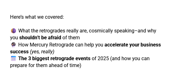
Summarizing the most exciting bits of what went down in a simple bullet point list like this:
Finally, don’t forget to tell your audience how long the replay will be available.
48 hours used to be the gold standard for webinar replays; that said, lately, I’ve been seeing better results with 3-7 day replay windows.
Do with that information what you will. 😉
Element #2: Details about your offer
Were you thinking about dropping the replay link & hoping your people find their own way to your course sales page?
Nope, not on my watch.
Even if you gave the most incredible, “you’ll kick yourself if you miss this” pitch during your webinar, assume that people:
- Missed it
- Forgot about it
- Need to see it again
Therefore.
You need to use the second half of your webinar email to remind your people that yes, there is indeed a paid offer on the table.
If you are DIY-ing this email, keep this part short, sweet, and skimmable. Bullet points are your best friend here.
For now, focus on the transformation (“land your first client in 30 days”) rather than the features (“8 in-depth video lessons”).
⬇️ Here is a beginner-friendly template you can try out yourself:
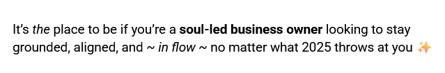
It’s the place to be if you are a <audience descriptor> looking to <the result they want> in <time horizon>.
Element #3: Crystal clear calls-to-action
A webinar follow-up email is one of the rare exceptions to the “one call-to-action (CTA) per email” rule.
Yes, you want your reader to go look at your sales page (and buy your program)…
But you also know that they may need a biiiiiit more time to warm up to the idea.
That’s why, in most cases, you will end up with two CTAs:
- One leading to your webinar replay, and
- One leading to your sales page
🧁 Which means you need to be extra-extra-clear (with sprinkles on top!) when crafting these particular CTAs.
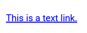
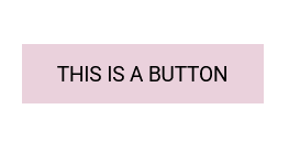
If I were you, I’d use two different types of CTAs for contrast and clarity:
An in-line text link for the webinar replay:
And a colorful CTA button for the program enrollment:
This helps establish a clear visual hierarchy and lets your audience quickly find the CTA that fits where they’re currently at.
Element #4: Social proof
I always ask my clients to include some sort of social proof in their webinar follow-up email.
Most of the time, it’s going to be social proof from the webinar itself, such as chat screenshots or “omg this was so good!” Instagram DMs you received after wrapping up your presentation.

Your main goal here is to get people to the replay page–then let it do the rest of the heavy lifting when it comes to actually selling your program.
However, if you want to take a more direct approach, you can include social proof from your course or program instead.
This strategy tends to work better if you’ve had a longer pre-launch period and your audience is already quite familiar with your program.
👍🏻 If you are a beginner, I’d go with the first option (webinar-specific feedback)–but don’t be afraid to experiment and see what works best for your business.
Element #5: Urgency
PSA: Using (real, non-manufactured) urgency in your marketing is not manipulative.
When people know that an opportunity has an expiration date, they are more likely to take action.
🤷🏻♀️ That’s just how our silly little human brains work.
In most cases, you’ll be doing your potential student a favor by nudging them towards taking action.
That action could be purchasing your program… Or it could be moving on to another thing or resource that will serve them better.
Either way, it breaks them out of the procrastination cycle, which is a win in my book.
There are three main urgency elements that you should consider including in your webinar follow-up email:
- The replay deadline
- Any time-sensitive bonuses
- Any time-sensitive discounts
Unless you have a very, very short launch window, I would not prioritize sharing your “cart close” date here, as it’s probably still too far out to be effective.
Element #6: A fun sign-off
Everyone always talks about adding more personality to your emails… But how do you actually do that?
🌶️ You can start by spicing up your webinar email sign-off.
Instead of a generic “best wishes” or “all my best”, try to connect your email sign-off to the topic of your webinar.
For example:
- In avocado toast we trust 🥑, <your name> (for a health coaching webinar)
- To big transits & brave decisions 🪐, <your name> (for an astrology webinar)
- Streamlined & systematized, <your name> (for an automations webinar)
Little humorous touches like this can go a long way in building your “know, like, trust” factor (as well as proving that you are not a robot).
Element #7: A short TL;DR
I like to include a TL;DR (“too long; didn’t read”) in the P.S. section in almost every single email I send.
Why? Because that’s where the skimmers tend to congregate, of course.
I’ll usually use the TL;DR section of a webinar follow-up email to remind people about the webinar replay (rather than the program details).
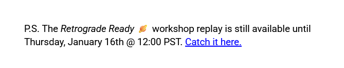
⬇️ Here is a little template for you:
P.S. The <webinar name> replay is still available until <deadline>. If you want <their goal or desire>, make sure to catch it before then.
Webinar Follow-up Email Template for Course Creators
If you are just starting out and want to DIY your very first webinar follow-up email, here is a simple template you can follow:
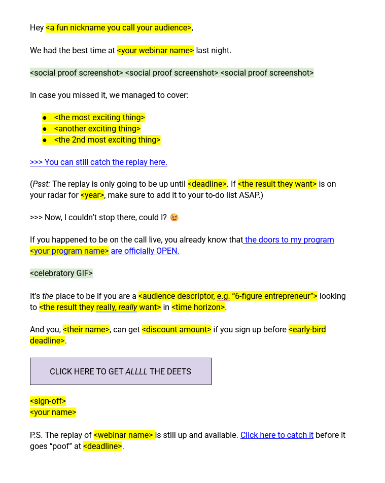
Hey <a fun nickname you call your audience>,
We had the best time at <your webinar name> last night.
<social proof screenshot> <social proof screenshot> <social proof screenshot>
In case you missed it, we managed to cover:
- <the most exciting thing>
- <another exciting thing>
- <the 2nd most exciting thing>
>>> You can still catch the replay here.
(Psst: The replay is only going to be up until <deadline>. If <the result they want> is on your radar for <year>, make sure to add it to your to-do list ASAP.)
>>> Now, I couldn’t stop there, could I? 😉
If you happened to be on the call live, you already know that the doors to my program <your program name> are officially OPEN.
<celebratory GIF>
It’s the place to be if you are a <audience descriptor, e.g. “6-figure entrepreneur”> looking to <the result they really, really want> in <time horizon>.
And you, <their name>, can get <discount amount> if you sign up before <early-bird deadline>.
<button> Click here to get all the deets </button>
<sign-off>
<your name>
P.S. The replay of <webinar name> is still up and available. Click here to catch it before it goes “poof” at <deadline>.
Webinar Follow-Up Email Subject Line Ideas (+ Examples)
Here are a few subject line + preview text ideas you can play with for your own webinar follow-up email:
Replay-focused subject line idea
Subject line: [workshop replay] Retrograde Ready 🪐
Preview text: “the best astro workshop I’ve EVER been to”
Desire-focused subject line idea
Subject line: how to *actually* have your first $5K month
Preview text: catch the replay + grab your early-bird bonus 🎁
Pain-focused subject line idea
Subject line: watch this if Dubsado is driving you up the wall
Preview text: workshop replay + HUGE early-bird savings 💰
Feel free to swipe any of these–just don’t forget to swap out your webinar details where needed.
Umm… Is This The Only Way To Write This Email?
Absolutely not.
I kid you not, there are hundreds of different approaches we could take when writing your webinar follow-up email.
We could lean more heavily on the webinar replay (and leave the sales pitch out of it entirely).
We could go straight into the sales pitch, only dropping the replay link into the P.S. section.
We could send different follow-up emails to different segments of your email list (e.g. people who attended vs people who didn’t).
🤍 There’s no one right way to do this.
The template I’ve given you here is just a starting point for the brave DIY-ers among us.
So get out there. Try it out. Experiment to see what works.
I know you’ve got this.
Wait, How Many Webinar Follow Up Emails Should I Send?
If all you can do is send out this one follow-up email, great!
Job well done.
That said, if you’ve got the time and energy to spare, I’d recommend sending out 2-3 webinar follow up emails (a.k.a. launch emails centered around your webinar replay).
📸 This will help you make the most out of the incredible content you’ve already created.
What Email Marketing Software Do You Recommend?
I’ve said it a hundred times, and I will say it again: if you are just starting out in the digital product space, Kit (formerly ConvertKit) (aff) is your best bet.
It’s simple. It’s intuitive.
And it’s got all the automations you need to get up to that coveted six-figure mark (and sometimes beyond) without spending a fortune on technical help.
💌 Get yourself a 14-day free trial here (aff) and thank me later.
Where To Next?
Do you have the rest of your webinar emails sortedalready?
If not, my Course Creator’s Guide to Webinar Invitation Emails could be a good read for you.
👋🏻 Want *someone else* to take care of all your email copywriting needs? This sales funnel (*ahem* ecosystem) copywriter would be delighted to help.
“Hey, Ieva–how do I write a webinar invitation email that gets my potential students fired up to attend my free class?”
Fantastic question, my online business friend.
Your webinar invitation email is one of the most important pieces of your launch email strategy as a course or digital product creator.
So let’s make yours a great one, shall we?
What Is A Webinar Invitation Email?
A webinar invitation email is a marketing email sent to potential participants to invite them to a live or pre-recorded online event (often called a “webinar”).
📌 It typically includes an overview of key event details (like topic, date, time, and speaker information), a clear value proposition, and a call to action.
Webinar invitation emails (also known as “webinar registration emails”) are a core part of many well-known course launch strategies, including those taught in Amy Porterfield’s Digital Course Academy and Jeff Walker’s Product Launch Formula.
How to Write an Effective Webinar Invitation Email
Tip #1: Start with the details
Okay, this might be the most boring part of our endeavor here…
But you gotta get the details right if you want to see those sign-ups rolling in.
✅ Every webinar invitation email should include the following information:
- WHAT: The topic of your webinar or workshop
- WHEN: The date, time, and timezone of your webinar
- WHERE: The platform + a link to register
- HOW LONG: Your best estimate of the session length
- WHY: What’s in it for them
Make sure you have all of these details locked in before you start writing the rest of the email.
You can even repurpose the format above inside your invite like this:

Tip #2: Choose your hook
A “hook” is a compelling idea, phrase, or angle designed to quickly grab your audience’s attention and make them want to keep reading.
Just like your Instagram reels need a strong hook… Your emails do, too.
🪝 A few hooks you can try for this email specifically:
- Debunk a myth (“big girls can’t run”–umm, are you sure about that?)
- Disagree with someone (“it’s not the carbs, girl–it’s this”)
- Showcase a hyper-specific result (“how I booked 5 high-ticket clients in 10 days–with no sales calls”)
Tip #3: Highlight a core benefit
78% of people would not sign up for a webinar that feels too “salesy.”
Yes, your webinar is a sales tool–but it also has to be more than that.
What sort of transformation would someone experience if they attended your webinar but didn’t choose to move forward with a purchase?
🤔 In other words… What’s in it for THEM?
A simple way to access the core benefit is to ask yourself how attending this event would improve your audience’s life in one of these three areas:
- Health (physical, emotional, mental)
- Wealth (money, business, career)
- Relationships (love, connection, community)
Here’s an example of a core benefit being highlighted in an email from a breathwork coach:

Tip #4: Let your personality shine
When you search the term “webinar invitation email”, the entire first page of Google is filled with (really boring) advice for (kinda boring) SaaS companies.
“Be brief”
“Keep it short”
“Get straight to the point”
If you are a course or digital product creator, that advice is NOT for you.
Your personality is one of the most valuable assets you have as a small business owner.
So you better own it.
Write like you talk.
Call your audience out on their BS.
Tell your longest, most dramatic dating story (just don’t forget to connect it to your offer).
Put that personality to work, baby.
The easiest, most low-lift way to add more personality to your webinar emails?
🌶️ Spicing up your email sign-off.
Instead of a typical “cheers” or “best wishes”, inject some humor into your email sign-off by connecting it to your area of expertise and/or the topic of the webinar.
Here are some examples:
- With love & avo toast 🥑, <your name> (for health coaching webinar)
- Astrologically annoyed, <your name> (for a class about Mercury Retrograde)
- To spreadsheets & solvency, <your name> (for an accounting workshop)
Tip #5: Include at least two CTAs
You need to give your reader more than one chance to say “yes” to your invite.
❗Aim to include at least two clickable calls to action (e.g. “Save your spot” or “Sign me up, babe”) in your email: one near the top, and one near the bottom.
This will increase the chances that your potential student will click through to your conversion-optimized opt-in page.
Pro tip: Use different wording for each call-to-action to make them stand out more.
Tip #6: Add a TL;DR
Some people are born skimmers (hi, it’s me! 👋🏻)–so let’s make it easy for them, yeah?
Use the P.S. section of your email to include a quick “TL;DR (too long, didn’t read) summary of what your webinar is about + a link to sign up.
Here is an example:
P.S. TL;DR? Replace your expensive coffee habit with a 5-minute energizing breathwork routine by clicking this link.
Tip #7: Send more than one email
🤷🏻♀️ Not everyone will resonate with the same angle or hook.
Some people respond best to storytelling, while others need urgency to take action.
If you were my client, I’d probably encourage you to send out multiple promo emails (each one using a different angle or hook) leading up to your webinar.
(Psst: No, you’re not being annoying when you do this. You are simply giving your audience another chance to say “yes” to something that could change their life.)
Sooo… How Many Promo Emails Should I Send?
If you only send one email to your list, that’s still a win in my book.
However, in an ideal world, I’d have you send anywhere between 3 and 5 webinar invitation emails–in addition to incorporating little hints of what’s to come in your pre-launch content.
Think that’s a lot of reminders?
It kind of is.
But please know that people are not snubbing you by not signing up immediately.
😵 They’re just distracted by the chaos of everyday life (like picking up after their toddler who just threw their Cheezits all over the floor).
Give them another chance to say “yes”, okay?”
When Should I Send My Webinar Invitation Email?
💌 You should start sending out your webinar registration emails 7-14 days before the big event.
Even if you announce it earlier, you will probably see the most registrations in the week leading up to your presentation. (What can I say, urgency is a great motivator.)
That doesn’t mean you can’t let your audience know what’s coming ahead of time.
Feel free to drop little hints about your webinar topic in your other emails and social media posts up to 30 days before your webinar.
(It’s also a great way to collect questions from your audience and find more ways to improve your presentation.)
And as far as the best day of the week to send your emails goes…
According to this bit of research, most webinar registrations happen on Tuesdays (21%), followed closely by Thursday (20.3%) and Monday (19%).
Do with that information what you will.
Webinar Invitation Email Template
If you are just starting out and want to DIY your very first webinar invitation email, here is a simple template you can follow:
Hey there, <a fun nickname you call your audience>!
You know what really grinds my gears?
When the so-called “experts” tell people to <advice you disagree with>.
<INSERT AN EXASPERATED GIF>
This couldn’t be further from the truth.
And I’ve got the receipts to prove it.
Wanna see me break down the <your industry> industry BS–and find out how to finally <the transformation they will receive>?
Join me for my upcoming workshop, <your workshop name>.
Here are the details:
- 📅 What:
- 🕒 When:
- 🌐 Where:
- ⏳ How long:
- 💡 Why you should come:
Click here to join the party.
<funny sign-off>
<your name>
P.S. I’m hosting a workshop to help you <insert benefit>. Save your seat here.

Webinar Invitation Email Subject Line Examples
Here are a few webinar invitation email subject line examples to get your brainstorming party started:
When you want to bust some myths
Subject line: don’t make the same mistake I did
Preview text: the so-called “experts” were lying to us
Subject line: umm… why did no one tell me this?
Preview text: apparently it’s *that* easy
When you want to share what worked
Subject line: everything I did to make $54.3K this weekend
Preview text: launch strategies, energetics, and the # of my copywriter
or
Subject line: stuff I no longer suck at
Preview text: folding a fitted sheet is *not* on the list
When you just want to get to the point
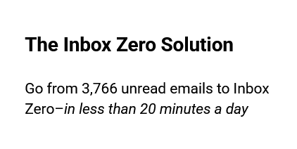
Subject line: want to know what Inbox Zero feels like?
Preview text: join me for this free workshop
or
Subject line: [new workshop] got sales woes?
Preview text: not after you open this email
Try these out for your next promo email–then report back and tell me how it went.
What Email Marketing Software Do You Recommend?
Personally, I’m a huge fan of Kit (formerly ConvertKit) (aff).
However, my clients have used every email marketing software under the sun, including MailChimp, ActiveCampaign, and even Kajabi’s internal email tool.
They all work–as long as you do the work to set them up right.
Kit is the easiest one for newbies to figure out, though. 😉
Where To Next?
Want to learn how to write better emails? My Course Creator’s Guide to Welcome Emails blog post might be a good place to start.
👋🏻 Want *someone else* to take care of all your email copywriting needs? This launch & sales funnel copywriter would be delighted to help.

Looking for thank you page ideas that go beyond “Thanks for signing up! Your new resource is on its way to your inbox 💌”?
You’re in the right place.
In this post, I’m sharing 7 thank you page ideas (with examples!) for digital product creators who want to:
- Increase their course completion rates
- Minimize the chances of “buyer’s remorse”, and
- Become their customer’s favorite follow on Instagram
Yep, your thank you page can accomplish all that and more. Let me show you how.
What Is A Thank You Page, Anyway?
A thank you page is a web page that your user sees when they perform a particular action on your website.
That action could be:
- Subscribing to your email list
- Purchasing a course or digital product
- Clicking a link that lets you know what type of content they like
… And many others.
Most people treat this page as an afterthought, putting up a generic “Thanks! You’re all set.” message and calling it a day.
But you are not most people, are you? 😉
Why Your Thank You Page Deserves More Love
Let’s imagine two scenarios.
In Scenario A, your new subscriber or student reads through your thank you page (chuckling quietly to themselves as they do it)…
And immediately heads over to Gmail, eager to see your welcome email pop into their inbox.
When it does, they jump straight into their new resource, like a kid opening presents on Christmas morning.
Two hours later, they are texting all their friends about how awesome you are (and how they should all join your programs, too).
In Scenario B, that same subscriber/student glances at your thank you page, shrugs, and immediately gets distracted by a cute corgi video on TikTok. (Ooops!)
Three hours later, they’ve completely forgotten about the resource they just downloaded.
And if they haven’t?
The momentum is just not there anymore.
The next time you send them an email, they’ll go “who’s that person again?” and send it straight Spam.
➡️ Tell me: would you rather end up in Scenario A… Or Scenario B?
(Silly question, I know.)
A well-designed thank you page can help you ensure you always end up in Scenario A (and with an email list full of eager subscribers and students who can’t wait to hear from you again).
Look, I get it: your to-do list as an online business owner is probably longer than the bathroom line at The Era’s Tour.
But optimizing the “little stuff” (like your thank you page) is how you can set yourself apart from the 43,593 other course creators on the market.
So let’s get to it, shall we?
7 Thank You Page Ideas For Digital Product Creators
Idea #1: Compliment your reader
One of my favorite things to do on a thank you page is to compliment the person on the other side of the screen.
♥️ A genuine compliment is one of the easiest ways to make someone feel good–not just about themselves, but also about the decision they just made.
(Bye-bye, buyer’s remorse!)
Here are a few ways to include a compliment on your thank you page:
- Well done, <a cute nickname you call your audience>
- Your taste is impeccable, my new internet friend.
- Oooh, we’ve got an action-taker over here! Nice.
And here’s an example:
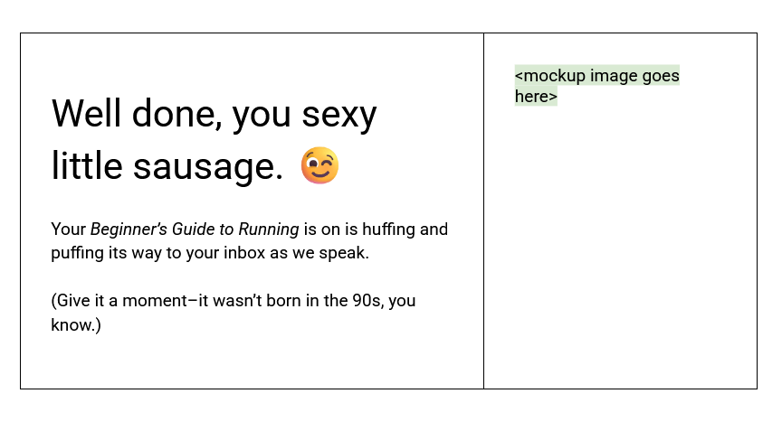
(Before you ask–yes, I have a client who calls her people sexy little sausages. She’s awesome.)
Idea #2: Let them know what to expect
The moment after someone signs up for a resource (free or paid) can feel a bit destabilizing.
The excitement of Doing The Thing is still in the air… But where do we go from here?
🔨 Your job is to replace that uncertainty with a crystal-clear roadmap of what happens next.
This will help your people feel like they’re being taken care of–which is what you want if you’re hoping to nurture that relationship.
A few things I always like to remind people of on a thank you page:
- That an email with their access is on its way to their inbox
- That they might have to wait 5-10 minutes for it to appear (and that there’s nothing wrong with that)
- That they might *also* have to check their Spam or Promotions folder if they don’t get it within the allotted time
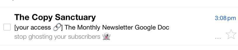
If you want to go one step further, you can also share a screenshot of what the email will look like once it lands in their inbox:
Finally, it’s always a good idea to have your contact information available *somewhere* on the thank you page.
Sometimes the email gremlins will decide to steal your welcome emails, and there’s nothing you can do about it.🤷🏻♀️
Idea #3: Collect some intel
A thank you page is the perfect place to collect valuable Voice of Customer data.
You can do this by adding a single-question survey to your thank you page via an embedded form like this:
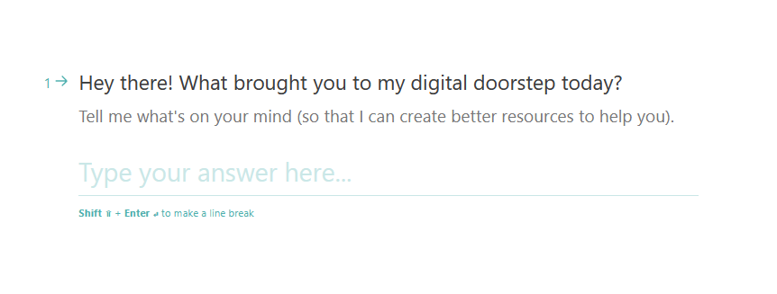
(I’m serious about the “single question” part. This is not the time to ask someone to fill out a form that takes 15 minutes to complete.)
🔍 So, what question should you ask?
For free resource thank you pages, my personal favorite is:
“What brought you to my digital doorstep today?”
If they just bought a paid product, you can go with something like:
“What are you most excited about when it comes to <your product name>?”
Over time, gathering and analyzing this data will let you see patterns and write better copy.
(Your copywriter will absolutely *adore* you if you implement this idea, btw.)
Idea #4: Show some personality
Yes, your thank you page has to be clear.
No, it doesn’t have to be boring.
I would argue that a thank you page is one of the best, most “low-stakes” places in your sales funnel to let your personality shine.
🎨 Here are two simple ways you can add more personality to your thank you page:
Add a celebratory GIF
A well-chosen GIF can add personality, humor, and a touch of whimsy to an otherwise basic thank you page.

You can make your own using a tool like Canva’s GIF maker or find something from a movie or a TV show you know your audience will love on GIPHY.
Here few of my favorite search terms to use when looking for thank you page GIFs:
- Congratulations
- Clapping
- Party
- Celebration
- Dancing
… I think you get the idea, right?
Say something only YOU would say
Remember the “sexy little sausage” example from above?
^^ That’s what I’m talking about here.
Starting off your thank you page with a specific, memorable phrase like that will help you build instant brand recognition, as well as filter out people who are not a good fit for you.
Not sure what that could be for you?
A few ideas to kickstart your brainstorming process:
- A hyper-specific nickname you call your audience
- A niche reference to your favorite TV show (“Oy with the poodles already!”)
- A reference to your favorite T-Swift song (“Look what you just made me do”)
Idea #5: Connect through video
83% of consumers want to see more video content from brands in 2025.
Well, alright then. 🤷🏻♀️
Personally, I’m not a huge fan of video content (corgi videos being the exception)–but a good chunk of your audience members might be.
So why not give the people what they want and film a short “welcome” video for your thank you page?
It doesn’t have to be a big production either: a simple Loom video of you saying hello + welcoming them to the community will do.
Keep it to less than 2 minutes, add in captions if you can (#accessibilityrocks), and include a simple CTA at the end (“Go check out the welcome email I just sent you!”).
Idea #6: Add more social proof
You know those excited DM’s people send you after going through your course?
The “omg, I can’t believe I waited so long to buy this” ones?
And the “girl, the first module totally blew my mind” ones?
(If you are not getting those yet, we need to talk.)
📷 Screenshot them and put them on your thank you page.
Seeing other people be excited about Your Thing will motivate your new subscriber or student to start engaging with it right away (rather than letting it rot in their digital product graveyard).
Idea #7: Add a “While you wait…” section
If you know that your fabulous welcome email sequence will take 5-10 minutes to reach your reader’s inbox…
Consider giving them something else to do (a.k.a. an alternative to watching corgi videos) in the meantime.
📖 Got a super popular blog post on your site that tends to blow people’s socks off the first time they read it?
Try adding to your thank you page like this:

Yes, you might run the risk of your reader getting distracted…
But it still keeps them engaging with your sales ecosystem, which is a definite win for you.
BONUS IDEA: Invite them to a private community
Speaking of keeping your reader engaging with your sales ecosystem…
Do you have a Facebook group or another space where all of your people can congregate to talk about how awesome you are?
(Jk. But only kind of. 😜)
If you do, make sure to drop a link to your group on your thank you page.
And if you don’t?
One of my mentors, Elizabeth Goddard, teaches a workshop called “Client/Student-Only Groups FTW” where she talks about this strategy in more detail.
Do I Need To Implement All Of These Thank You Page Ideas?
Nope! Even testing out one or two of these ideas could help you form a better connection with your new subscribers and students.
If you need a place to start, I would:
- Outline their next steps
- Show some personality with a fun GIF, and
- Share 3-5 pieces of screenshot-style social proof
… In that order.
Once you’ve got those three sorted out, you can move on to the other thank you page ideas I shared above.
My Favorite Tool For Designing Thank You Pages
If you are a Showit user, you may have already heard of TONIC Site Shop (who hasn’t?)…
But do you know that they have a gorgeous landing page bundle that comes with two (!) different, launch-copywriter-approved thank you page layouts?
Just look at this beautiful “next steps” section:

^^ If I were designing a thank you page from scratch–and had no design experience whatsoever–I would hit them up first.
Got More Qs?
👋🏻 Looking for more fun thank you page ideas? Or maybe you’re not sure which ones would work best for your business?
One of my 60-minute Sounding Board Sessions might just help you figure it all out.
And hey, if you’d rather hand off the whole “writing sales copy” thing to someone else entirely?
Perhaps it’s time to hire me as your sales funnel copywriter. (<<< Although I much prefer the term “sales ecosystem” myself.)
“Hey, Ieva–how do I write & design a course checkout page that actually gets my people to click the “Buy Now” button?”
Great question.
Many digital product creators overlook the importance of a well-designed checkout page, focusing more on “flashier” assets like their sales page or Instagram content.
I’m glad you’re not one of them! 😉
If done right, a conversion-optimized checkout page can help you ease any last minute doubts your customer might by having (“Maybe I should buy that new espresso machine instead?”) and set the tone for your entire digital relationship.
It’s the last conversation you’ll have with a potential buyer before they commit to your product–or go back to aimlessly scrolling TikTok. So let’s make it a good one, yeah?
What Is a Checkout Page, Anyway?
A checkout page is that wonderful place where your soon-to-be customer enters their payment information and (hopefully) completes the purchase.
(Groundbreaking stuff, I know.)
That said, let’s take a moment to zoom out and look at it in the context of your entire sales funnel.
🔑 In this context, a checkout page is the final door someone has to walk through before they transition from being a curious onlooker to a paid customer.
At this point, this person has already read your sales page, seen some of your launch emails, and scrolled through your Instagram looking for free tips.
They know who you are and they are *pretty sure* they want what you’re selling.
So the true purpose of your checkout page?
- Alleviating any last-minute worries they may have, and
- Making the payment process as smooth and easy as possible
That’s it.
Keep these two goals in mind when writing and designing your course checkout page, and you will be in better shape than most beginner creators out there.
The Two Types of Course Checkout Pages
There are two main types of checkout pages: one-step and multi-step.
➡️ In a one-step checkout situation, everything happens on a single page.
Your customer fills out their name, email, and payment information all in one go, then hits the “Purchase” button to complete the process.
With a multi-step checkout, the process gets broken down into separate steps.
Your customer may enter their name and email address on the first page, then click through to move on to the payment details page next.
This means that in some cases, you may be able to capture the potential buyer’s email address even if they don’t complete the purchase (giving you a chance to work some abandoned cart sequence magic later).
Which Type Should You Choose?
As a copywriter-slash-funnel strategist, I usually see better conversion rates with single-page checkouts.
Since everything is right there on one page, they are much easier to optimize, leading to higher conversion rates over time.
(As a customer, I also find them less overwhelming and confusing than multi-step checkouts–and so do most of my clients. Make of that what you will.)
🤔 A multi-page checkout process definitely feels a bit clunky in comparison.
That said, if you’ve got a strong abandoned cart sequence you’re itching to try, it’s worth experimenting with.
Sometimes a well-timed reminder (“hey, do you still want this?”) can be the best thing for you AND your customer.
Bottom line: if abandoned cart email sequences are not on your radar yet, go with a single-page checkout, and follow the tips below to make yours the best it can be.
How to Design a Course Checkout Page That *Actually* Converts
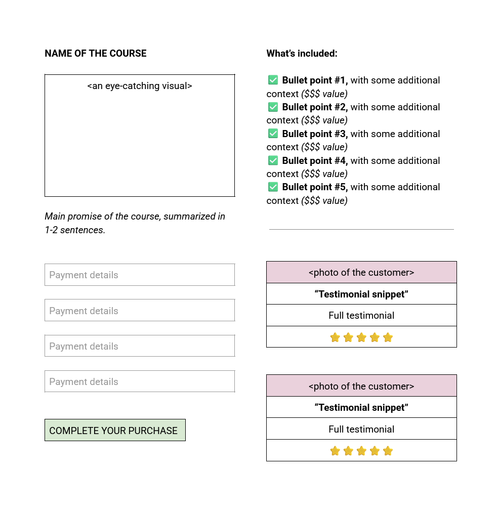
Element #1: Your course or digital product name
Okay, yeah, this seems painfully obvious–but is it? 🤦🏻♀️
I’ve been in the online business space for more than seven years now, and I’ve seen far too many checkout pages that are nothing but a generic order form with a dollar amount at the bottom.
People get distracted.
So remind them what they’re buying.
Starting with the name of your course or digital product.
Element #2: Tagline or a (short!) description
You don’t need to include your entire sales pitch on your checkout page (that’s what your sales page is for).
A short description–or your course tagline, if you have one–will do just fine.
💡 When in doubt, summarize your main promise in 1-2 sentences using this formula:
Go from <Point A> to <Point B> in just <TIME LIMIT>–without <UNDESIRABLE THING>.
Here’s an example:
Element #3: An eye-catching visual
You know that cool mock-up image you (hopefully) created for your sales page?
(The one with the little laptop/iPad/other course materials?)
Let’s add one to your checkout page, too.
Now, it doesn’t have to be as elaborate as the one on your sales page (you probably won’t have space for that).
But a little visual can go a long way when it comes to reminding your audience that, yes, the thing they are buying is real.
📷 Alternatively, you can also use Canva to design a simple graphic with your course name, tagline + a photo of yourself.
Seeing your beautiful face right there on the checkout page can help soothe some of those same anxieties (“okay, yeah, so this course is taught by a real person”).
Element #4: A snapshot of what’s included
Remind your soon-to-be-student exactly what they’re getting in 5-7 snappy bullet points.
Focus on the big picture stuff, like the core modules, group calls, and community access.
✍🏻 If you have the space, consider adding a little extra info to punch up each bullet point.
For example, instead of saying:
✔️ 6 months inside The Draft-To-Done Community
Add a little extra info about what’s included, like this:
✅ 6 months inside The Draft-To-Done Community, including weekly hotseat calls and daily support inside our FB group (valued at $1000)
Or remind them why that particular feature is something they want:
✅ 6 months inside The Draft-To-Done Community, where we’ll make 100% sure you get a first draft to your editor at least 24 hours before the deadline
^^ No space for that much copy? No problem.
Regular bullet points will do just fine as well.
Element #5: Social proof
You know how we talked about alleviating any last-minute doubts on your checkout page?
Social proof can definitely help with that.
Shoot for 3-5 pieces of social proof on this page (but try to add at least one, even if it’s not “perfect”).
✅ Try to prioritize feedback that highlights tangible results (“83% increase in leads” or “No more crying at H&M”) rather than personality-based feedback (“Ashley is such a great teacher!”) for this particular page.
A few different types of social proof you can play around with:
Regular testimonials
Use a short, powerful snippet as your testimonial title, placing the rest of the testimonial underneath it, like this:
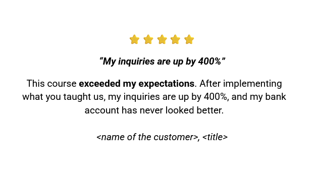
Bonus points if you can include a (tiny) photo of the person who said it.
Screenshot testimonials
You can use testimonial screenshots from your DMs, Slack messages, or Instagram comments on your checkout page–as long as you ask the person for permission first.
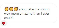
These types of testimonials have the advantage of feeling a bit less staged than regular testimonials.
“Featured in” section
You know the “featured in” section you often see on people’s websites?
The ones with a ton of logos of companies they’ve worked with?
While I wouldn’t put it front and center on your checkout page, it could be interesting element to add at the bottom of the page (after the payment form) if you have the space.
Element #6: Money-back guarantee
Your digital product may not have a money-back guarantee–but if it does, it deserves a spot on your checkout page.
A reminder of your money back policy can offer some much-needed reassurance (“hey, you can still change your mind!”) and help put your potential buyer at ease.
Element #7: What happens next
Okay, we are going above and beyond here…
But adding a sentence or two about what happens after they click the “Buy” button can go a long way in easing people’s anxiety.
This is especially important if your audience is comprised of people who are not necessarily familiar with the digital product space.
🥰 Ease their worries by leaving them a little “what happens next” reminder like this:
Once you complete your purchase, you’ll receive an email with your course login details and instructions to access the content within 5-10 minutes.
BONUS ELEMENT: An order bump
An order bump is a small, additional offer you can present right on the checkout page, related to the main course or product they are purchasing.
For example, if you are selling a course on email marketing, your order bump could be a bundle of customizable launch email templates.
This offer should feel like an absolute no-brainer to add on.
A mismatched order bump can actually mess up the conversion power of the rest of your page.
🙅🏻♀️ So you are not sure you’ve got the right product for it, it’s best to leave it off for the time being.
Do I Need To Include All Of These Elements?
Not at all.
I would say that the first five elements (name, tagline, visual, a bullet point list of what’s included + some form of social proof) are the most important.
These are the core elements of good checkout page design that will help alleviate any last-minute worries and move your people closer to the “Buy” button.
Everything after that is optimization (and can be handled after you’ve re-launched your course a couple of times).
So if you’re feeling overwhelmed?
⬇️ Start at the top of the list and work your way down.
Digital Product Checkout Page Design Example
🎨 Here is an example of how I would structure a checkout page for one of my copywriting clients (using the principles outlined above):
What Tools Do I Need To Build My Checkout Page?
If you are using an all-in-one course platform like Teachable or Thinkific, you will probably have access to some sort of checkout page software within your subscription.
That said, these tools don’t always have the most flexible checkout page design/layout options…
Which could be a problem if you want to get the most out of yours.
My Favorite Checkout Page Design Tool
I do a little happy dance whenever a new client tells me they are using ThriveCart for their checkout pages.
It lets me know we will have the flexibility to create something truly fabulous together (and I won’t have to hold back on my copy magic because of any design limitations).
Other people seem to agree.
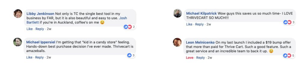
So if you’re in the market for some new digital product software…
Check out (ha! get it? 😄) their checkout page builder here.
Got More Qs?
You can always book a 60-minute Sounding Board Session with me to go over any remaining questions or look over your first draft together.
And hey, if you’d rather hand off the whole “writing sales funnel copy” thing to someone else entirely?
Perhaps it’s time to hire me as your conversion copywriter.
“Hey, Ieva–how do I create a tripwire offer that actually helps me convert my new subscribers into buyers?”
So glad you asked, my internet friend.
When it comes to selling digital products, tripwire offers are often positioned as a “magic bullet” of sorts.
“Make back your ad spend overnight! Scare those pesky freebie seekers off your list!! Buy a Rolls-Royce tomorrow with all the cash you just raked in!!!
(Umm… Can we not? Please? 🙄)
The truth is, tripwire funnels *can* be pretty magical–but they are much harder to get right than the internet marketing bros make it seem.
The first step in getting it right? Making sure your tripwire offer *itself* is as enticing as possible.
What Is A Tripwire Offer?
💡 A tripwire offer is a low-cost product designed to “trip” (<<< gosh, don’t you just hate this terminology?) new subscribers into becoming buyers immediately after signing up to your list.
Instead of sending your new subscriber to a thank you page after they sign up, you will send them to a mini sales page (also known as a tripwire page) for one of your paid offers.
Most of the time, there will be a limited-time, “you can only get this on this page” discount available–although that’s not mandatory.
(Sometimes putting the right offer in front of the right audience at the right time is enough to get a “Yes”–no discounts required.)
The Psychology Behind Tripwire Offers
One of the reasons why tripwire offers work so well is what’s known as the “foot in the door” effect.
People who just said “yes” to something (like your free lead magnet) are more likely to say “yes” to something else (like your $7 eBook).
In other words, your freebie helps you get your foot in the door…
🚪 And your tripwire offer helps you nudge the door open.
Why You Need A Tripwire Offer
The “foot in the door” effect doesn’t end there.
Once someone becomes a customer (even if they make the tiniest purchase), they are more likely to purchase from you again.
And again.
And again.
See what I am getting at here? A solid tripwire offer (that actually delivers on its promise) can set you up for a lifetime of repeat purchases down the road.
💸 The $7 becomes $700… Maybe even $7000.
Plus, a quick cash infusion is always welcome, especially if you are running ads and want to make back your ad spend ASAP.
Are Tripwire Offers Scammy?
Let me be real with you: I don’t love the word “tripwire” (just like I don’t love the term “sales funnel”–but Mother Google does, so I use it anyway). 🤷🏻♀️
Like… Why are we tripping up people up again??
That said, I think intention matters here.
If you approach tripwire marketing with the energy of “let me trick some poor sod into buying this half-baked PDF while they are in a vulnerable emotional state”…
Yep, that’s scammy AF.
👉🏻 But if you strip away the gross energy and the sleazy sales tactics, a tripwire offer is just this:
Offering someone a resource they need, the moment they need it–at a price point that feels like a win-win for everyone involved.
So no, tripwire offers are not inherently scammy.
(Just hold off on the fake countdown timers, yeah? We all know we can get the same deal tomorrow if we sign up with a different email address.)
How To Create A Tripwire Offer That Converts
Tip #1: Go smaller
In my experience, the tripwrite offers that sell the best are TINY.
They solve ONE specific problem, ideally in 30 minutes or less. (That’s also my advice for creating a high-converting lead magnet, btw.)
Sure, some creators have seen success with the “here are 57 of my best resources for just $7 (worth $7000)” offers.
However, I would not recommend this strategy for most people.
Instead of feeling generous, the “everything but the kitchen sink” approach tends to come across as desperate.
📉 Seeing so many products on sale for so cheap can devalue your brand in the eyes of your new subscriber.
(Not great if you’re hoping to sell them more stuff down the line, y’know?)
Plus, dumping dozens of resources on someone can be quite overwhelming for the recipient.
Decision fatigue sets in, and they end up not cracking open a single one.
And when you try to sell them something else?
They don’t have a frame of reference for how awesome you are as a teacher, so your new offer doesn’t feel all that enticing.
Giant “let me fix your whole business” courses are also not a great fit for this type of funnel, for similar reasons.
Bottom line? When in doubt, go smaller.
Tip #2: Connect it to your freebie
Your new subscriber just downloaded a freebie all about creating a stellar onboarding workflow in Dubsado…
So why are you hitting them with your top 10 money manifestation techniques on your tripwire page?
I know it can be hard to hear (and even harder to do), but listen: you have to meet your people where they are at.
Sure, that new subscriber *might* be interested in money mindset (aren’t we all!)… But that’s not what they are actively thinking about in this moment.
Right now, they are thinking about their broken intake form automation they’ve been putting off fixing for months.
➡️ They don’t need mindset hacks. They need a Dubsado wizard to come and save them from automation overwhelm.
And yes, while you might moonlight as a business & manifestation mentor… You are that wizard.
And now is the best time for you to pull out your Dubsado grimoire and show them how it’s done.
Always make sure your tripwire offer connects to your lead magnet in some shape or form.
Dive deeper into one aspect of your freebie with a 20-minute training video.
Make it easier/faster to Do The Thing They Downloaded Your Freebie For with extra checklists or templates.
Or offer to solve an adjacent problem that someone who downloaded your freebie might be facing.
Just make sure your offer meets them where they’re at, okay?
Tip #3: Add a quick win
Most tripwire offers work best when there’s an element of instant gratification present.
💭 If your new subscriber will need months to see the first real results from your offer… A tripwire funnel is not the right place for it.
The magic formula?
Buy >>> Use >> Feel Awesome About Yourself–all before bedtime tonight.
Think: a cold email script they can customize and send today (instead of a 6-month cold outreach plan).
Or: A 20-minute Quick Start Guide to their Moon Sign they can listen to while washing dishes (rather than a whole library of 25 astrology videos they may never get around to watching).
If the person can buy it, use it, and feel like “yay, I did that!!” by EOD… You’re doing right.
(You can always follow up with your bigger, more substantial offers later. Selling during your welcome sequence is not a crime, after all.)
Tip #4: Nail the pricing
If we were working together, I would most likely recommend you price your tripwire offer between $5 and $50.
While you can go lower, pricing it at less than $5 will make it difficult to break even on your ad spend.
More than $50 veers into the “risky purchase” range: if someone just discovered you, they may not feel ready to part with an amount of money that would get them a nice meal at their favorite restaurant.
(The equivalent of a latte from their local coffee shop, though? Yeah, sure, we can do that. ☕)
Another question to consider is whether or not you want to use “charm pricing.”
Charm pricing is a pricing strategy where prices end in 7s or 9s (e.g. $27 instead of $30) to make the product appear cheaper than it actually is.
At the time of writing this, I can’t say that I feel too strongly about it/
For me, there are bigger ethical marketing fish to fry (looking at you, unsubstatiated income claims & AI-generated Stripe screenshots).
That said, some audiences might be more sensitive to charm pricing than others, and it’s always worth keeping your ear to the ground to gauge how your people feel.
Tip #5: Repurpose what you already have
You don’t have to create an entirely new product to use as a tripwire.
Do you have a $9 template you built and never did all that much with? It might make for a great tripwire offer.
Perhaps there’s a bonus video you’ve included in your course that your new subscriber could get a quick win out of? Package it up and sell it separately!
🎨 In my experience, the resources and tools YOU use in the back-end of your business actually make the best tripwire offers.
After all, you already know it works: all you have to do is package it up nicely for your audience, and you’re good to go.
My Most Successful Tripwire Offer
My most successful tripwire offer to date has been my Notion Course Tracker Template.
I first created this template when I was getting ready to participate in a huge online course bundle (= a limited-time promotional event where creators contribute their paid products for free in exchange for your email address).
My *actual* bundle contribution was this accomplishment-tracking template (also built in Notion).
On the surface, a course tracker template doesn’t seem all that related to my original contribution.
✅ However, I knew people would be receptive to it in that specific moment.
Why? Well, participating in bundles like that can be quite overwhelming, and having a way to track everything you just “bought” can be really helpful.
I also knew that the people who downloaded that first Notion template probably already had a Notion ecosystem of their own–which means that a second template was an easy “yes” for them.
(No need to learn new software!)
^^ Can you see how the success of this particular template can be traced back to all the tripwire marketing principles we discussed above?
It’s specific, it connects to the freebie, and it gives the customer a quick win (a convenient place to put all their bundle downloads).
Adding a small discount lowered the price of the template to just $7, so the investment was a no-brainer.
(My monthly cappuccino + pistachio croissant indulgence at the local bakery costs more than that, btw.)
Oh, and the best part? It was a template I was already using inside my own business ecosystem, so I didn’t have to go out of my way to create something new.
Tripwire Offer Examples That Work
Now that you’ve seen my favorite tripwire offer, let me show you some other examples to get your creative juices flowing.
Tripwire Offer Example #1:
Lead magnet: A “Houses 101” cheatsheet, covering the basics of each house in astrology
Tripwire Offer: A 20-minute audio training all about their 2nd House of money (‘cause people love to hear about ways they can bring in extra cash)
Why it works: It goes deeper into one specific aspect of the freebie + is small enough to get your new subscriber a quick win (they can just put it in their earbuds while they putter around the house).
Plus, since it’s all about making money, you can probably price it a bit higher ($27 and above).
Tripwire Offer Example #2:
Lead magnet: 3 Healthy 15-Minute Recipes For Busy Moms
Tripwire Offer: A $7 grocery list of must-have pantry staples to keep at your house to avoid grocery shopping all the time–ideally in multiple formats (printable + app-friendly versions)
Why it works: The offer solves a related problem that their audience tends to have
(“ugh, I never have the right ingredients!”).
It offers a quick win because they can use this list during their next grocery trip (the same one they’ll go on to get the ingredients for the initial recipes).
And $7? That’s a steal compared to the mental and physical energy required for a yet-another another last-minute grocery run.
Tools To Build A Tripwire Funnel
Want to know a secret? If you already have a way to process payments in your business…
🙅🏻♀️ You don’t actually have to purchase any extra tools to build your first tripwire marketing funnel.
You can simply build a tripwire sales page on your site!
(It might even look better than some of the cookie-cutter templates you can find inside the “fancier” software solutions.)
That said, if you are going to invest in a tool for building sales funnels (including tripwire funnels), I would recommend ThriveCart.
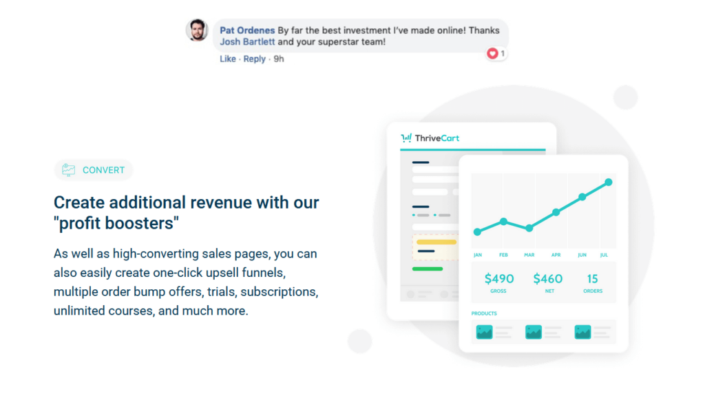
The occasional bug aside, Thrivecart really does do it all: sales pages, checkout pages, order bumps… You name it.
And the one-time payment option (with a built-in place to host the digital products you just sold), makes it a very attractive option indeed.
Ready To Build Your Own Tripwire Funnel?
👋🏻 I’d love to help.
Want to brainstorm some tripwire offer ideas–or some expert help in choosing the best one? Book a 60-minute Sounding Board Session with yours truly.
Need someone to take a look at a funnel that’s not performing as well as you’d hoped? My Copy Reviews might be right up your alley.
Would rather hand off the whole “writing copy” thing to someone else entirely? Perhaps it’s time to hire me as your sales copywriter.
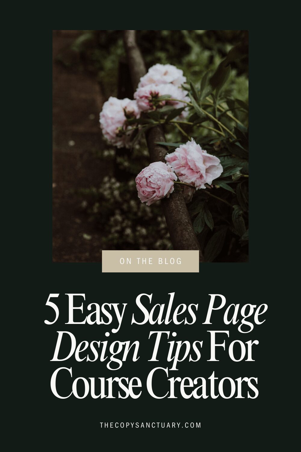
As a copywriter for course creators, I have seen far too many sales pages miss the mark because the design and copy simply aren’t working together.
In this post, I’m sharing the most common design mistakes I see people make on their sales pages–plus, practical sales page design tips to make sure your copy gets the attention (and conversions) it deserves.
Whether you’re DIY-ing your sales page, customizing a TONIC template, or working with a designer, these tips will help you create a page that’s not only beautiful… But also highly effective.
(And yes, these totally apply if you’re using a Google Doc as your sales page, too.)
5 Easy Sales Page Design Tips For Online Course Creators
Tip #1: Align your text properly
One of the most common–and easily fixable–mistakes I see course creators make when putting their copy into action?
Centering all their text like this:
Just because the text itself is in the center of the page, doesn’t mean you need to hit the “Center Align” button, too.
Centered text creates jagged edges on both sides, making it harder for the eye to follow.
It slows down reading speed and may frustrate your audience enough to make them click away from the page.
💀 In short? It’s a readability nightmare.
To avoid this, keep your text box in the center of the page… But hit the “Left Align” button instead.
This tiny change will make your copy much easier to read and digest.
Tip #2: Keep your paragraphs short
If your copywriter didn’t do this for you (and they should have!): make sure to keep your paragraphs short and sweet.
😵💫 Nobody wants to read a wall of text like this:
Instead, break it up into bite-sized chunks (2-3 sentences per paragraph, max).
Yes, this probably goes against everything you learned in school…
But writing a sales page is different from writing an essay for your English Lit class.
With attention spans dwindling at an alarming rate, short, snappy paragraphs are the way to go when it comes to high-converting sales pages.
Tip #3: Add some color contrast
Tell me: is this copy easy to read?
No, right?
🎨 That’s because the color contrast between the text and the background is not sufficient.
If you suspect that your current color palette might be putting you in a similar predicament, there are two things you can do:
- Use a tool like WebAim’s Color Contrast Checker to explore different color combinations yourself, or
- Book a session with a designer and ask them to help you adjust your brand colors according to the current web accessibility guidelines.
It’s a tiny tweak that can make a big difference–so try to get it sorted before your next launch if you can.
Tip #4: Add supporting visuals
If your sales page is composed entirely of text (and maaaaaybe a couple of photos from your brand shoot): we’ve got a problem, Houston.
While sprinkling in images of yourself (especially around your bio section) is a great start, you need other types of visuals to guide your audience’s attention and keep them engaged.
➡️ There are two other types of visuals you should consider adding to your sales page: mockups and icons.
Mockups
A mock-up is a visual representation of your course materials, designed to give potential buyers a tangible sense of what they’ll receive.
This could be:
- A laptop displaying your course dashboard
- A stack of beautifully designed PDF resources
- A phone + earbud combo to represent your private podcast
Including mockups on your sales page helps make your offer feel more concrete and “real”, even if everything is delivered digitally.
Icons
Icons can be a fantastic way to make your sales page more visually engaging (as well as easier to skim).
They can help draw attention to key sections–like benefit lists, module breakdowns, or bonuses–without distracting from the copy itself.
If custom icons are out of your budget, don’t worry! You can find great free options on sites like Flaticon, or explore affordable icon packs on Creative Market.
Tip #5: Make sure there’s enough white space
In the design world, “white space” (or negative space) refers to the empty areas around your website elements–like your text boxes, images, and buttons.
A good use of white space:
- Improves readability by giving your content room to breathe
- Guides your audience’s eye to the most important elements of your page
- Makes your sales page look clean, modern, and professional
Take a good look at your sales page.
💭 Does it look like the copy has enough space to breathe? Or do things look a little too squished together?
(If you’re looking for examples, this article on the importance of whitespace has some pretty good ones.)
Remember: white space isn’t wasted space. It’s a key ingredient in creating a sales page that’s both beautiful and persuasive.
Your Next Steps
From properly aligning your text to adding enough white space, implementing these tiny sales page design tips can make a big difference in your conversion rate.
That said, if your sales page isn’t converting as well as you’d like, there could be other factors at play–like your messaging, offer structure, and, yes, copy.
👋🏻 If you want some personalized advice on how to increase YOUR sales page conversions… My 60-minute Sounding Board Sessions might be right up your alley.
Think your online course sales page might need a little refresh in 2025? Well, you’re probably onto something.
Whether or not you’ve seen a dip in course sales over the last year or so, periodically updating your course sales page is just smart business.
After all, the online learning landscape is always evolving–and your sales page should, too.
A few strategic tweaks–like experimenting with the 3 sections I’m sharing in this post!–can help you stay ahead of the industry trends and update your online course sales page (without overhauling your entire sales funnel).
Wait… Do You Still Need A Sales Page For Your Online Course?
The trend of sending people straight to a checkout page has been around forever–and some coaches swear you don’t need to bother with sales pages at all. But is it true?
For most offers, I’d still recommend putting together a sales page–even if it’s just a simple Google Doc.
(For fancier options, check out these sale page designs by TONIC. #designheaven 😍)
Why? Because your audience is made up of different types of buyers.
While some will be happy to make the leap and hand over their hard-earned cash based on the connection they have with you, others will want to take a closer look at what you’re offering.
➡️ They’ll want to hear stories of the people you’ve helped, see proof of your results, and figure out how you measure up against the competition.
And the best place to give them all that information in one neat, persuasive package? Is still the good, ol’ online course sales page.
3 Must-Have Sections For Your Online Course Sales Page
1 | The Behind-The-Scenes Video
One of the best ways to get a “yes” from a potential buyer is to help them see exactly what they are getting.
For someone new to online courses, it can be hard to imagine what the learning experience will actually look like like.
Will it feel like logging into their old college portal? How will they access the lessons?
Others have been burned by the course creation industry before–receiving an AI-generated PDF after paying $500+ for a “custom” solution, realizing the entire course “portal” is just a bunch of half-finished Google Docs… The list goes on.
The bottom line?
🤷🏻♀️ Chances are, many of your potential customers are feeling uncertain about what awaits them after they press the “Buy” button.
My favorite way to alleviate this uncertainty is to film a short, informal walkthrough video using software like Loom or KomodoDecks.
Here’s how to do it:
- Open the back end of your course portal and hit “Record.”
- Start with a warm, friendly intro: “Hey, friend! I wanted to give you a quick peek at the course portal to help you see what your experience will be like.”
- Walk your audience through:
- What they will see when they log in
- What the orientation/onboarding process is like
- Where they can find extra help if they need it
Then embed this video right on your course sales page.
It’s a simple but powerful way to build trust, alleviate anxiety, and show your audience exactly what they’re investing in.
2 | The Comparison Table
(Credit where credit is due: I initially learned about this tactic from Prerna & Mayank. Thanks, guys!)
Why should someone buy your productivity course when they can read a $15 book on the same topic?
This is a great question–one that a comparison table can help you answer.
A comparison table lets you show how your course stacks up against other popular alternatives, like books, podcasts, and even other courses. It’s a great way to highlight the unique aspects of your course and make the value of it crystal clear.
You can ask your designer to make you one, or simply do a quick mock-up in Google Docs like this:
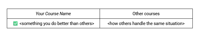
To get started, you will need to know what the most popular alternatives are in your niche.
Think:
- Books
- Podcasts
- Other courses
🙅🏻♀️ A word of caution: If you choose to make a direct comparison with another course in your niche, please be aware of the potential legal repercussions.
While specificity is king, the hassle–and the drama–might not be worth it.
3 | The Wall Of Love
After 7+ years in the online business space, my eyes tend to glaze over traditional testimonials like this:

They feel staged, overly polished, and… Well, to be honest, I just don’t want to read that much.
On the other hand, screenshot-style testimonials like this actually have a chance at grabbing my attention:

Now, I’ll admit, I still approach them with some skepticism. After all, almost anything can be faked these days (*cough cough* income claim screenshots *cough cough*).
But there is still an element of humanity and realness here that is not present in more traditional testimonial formats.
💌 While you can sprinkle these in thorough your sales page, I would also suggest creating a dedicated Wall of Love at the very end of your page (right before the final “Buy” button).
Simply stack 10+ of these screenshot-style testimonials–and voilà!
You’ve just wrapped up your sales page on a high note (and probably earned yourself a few extra sales).
BONUS: One Section To Remove From Your Online Course Sales Page
You know the “This is for you/this is not for you IF” section everyone loves to include on their course sales pages?
Most of them are… Well, terrible.
“This is not for you if you don’t want to make $20K this month” <<< No, Josh.
If you are going to keep this section around, make sure the bullet points you use actually mean something. Be as specific as possible.
Ask yourself:
What kind of person would actually get the most out of my course? And what kind of person would struggle to implement it?
💡 Some good ones include:
- This is for you if you already have a full-time employee (or a subcontractor you love to work with!)
- This is not for you if you haven’t made your first $1000 yet–a beginner course might suit you better
- This is not for you if your current season of life does not allow you to dedicate 1-2 hours a day to the implementation of this course
If you can’t get that specific? Maybe nix this section for now to avoid potential eyerolls (and lost sales).
Your Next Steps
Time to take action! Try adding one (or more!) of these sections to your existing online course sales page to see how it affects your conversions.
Remember, even the smallest tweaks can make a big difference in how your audience perceives your offer (and whether they hit the “Buy” button).
👋🏻 And if you want a little help zhuzhing up your page? Book a 60-minute Sounding Board Session with yours truly.

