


Think your online course sales page might need a little refresh in 2025? Well, you’re probably onto something.
Whether or not you’ve seen a dip in course sales over the last year or so, periodically updating your course sales page is just smart business.
After all, the online learning landscape is always evolving–and your sales page should, too.
A few strategic tweaks–like experimenting with the 3 sections I’m sharing in this post!–can help you stay ahead of the industry trends and update your online course sales page (without overhauling your entire sales funnel).
Wait… Do You Still Need A Sales Page For Your Online Course?
The trend of sending people straight to a checkout page has been around forever–and some coaches swear you don’t need to bother with sales pages at all. But is it true?
For most offers, I’d still recommend putting together a sales page–even if it’s just a simple Google Doc.
(For fancier options, check out these sale page designs by TONIC. #designheaven 😍)
Why? Because your audience is made up of different types of buyers.
While some will be happy to make the leap and hand over their hard-earned cash based on the connection they have with you, others will want to take a closer look at what you’re offering.
➡️ They’ll want to hear stories of the people you’ve helped, see proof of your results, and figure out how you measure up against the competition.
And the best place to give them all that information in one neat, persuasive package? Is still the good, ol’ online course sales page.
3 Must-Have Sections For Your Online Course Sales Page
1 | The Behind-The-Scenes Video
One of the best ways to get a “yes” from a potential buyer is to help them see exactly what they are getting.
For someone new to online courses, it can be hard to imagine what the learning experience will actually look like like.
Will it feel like logging into their old college portal? How will they access the lessons?
Others have been burned by the course creation industry before–receiving an AI-generated PDF after paying $500+ for a “custom” solution, realizing the entire course “portal” is just a bunch of half-finished Google Docs… The list goes on.
The bottom line?
🤷🏻♀️ Chances are, many of your potential customers are feeling uncertain about what awaits them after they press the “Buy” button.
My favorite way to alleviate this uncertainty is to film a short, informal walkthrough video using software like Loom or KomodoDecks.
Here’s how to do it:
- Open the back end of your course portal and hit “Record.”
- Start with a warm, friendly intro: “Hey, friend! I wanted to give you a quick peek at the course portal to help you see what your experience will be like.”
- Walk your audience through:
- What they will see when they log in
- What the orientation/onboarding process is like
- Where they can find extra help if they need it
Then embed this video right on your course sales page.
It’s a simple but powerful way to build trust, alleviate anxiety, and show your audience exactly what they’re investing in.
2 | The Comparison Table
(Credit where credit is due: I initially learned about this tactic from Prerna & Mayank. Thanks, guys!)
Why should someone buy your productivity course when they can read a $15 book on the same topic?
This is a great question–one that a comparison table can help you answer.
A comparison table lets you show how your course stacks up against other popular alternatives, like books, podcasts, and even other courses. It’s a great way to highlight the unique aspects of your course and make the value of it crystal clear.
You can ask your designer to make you one, or simply do a quick mock-up in Google Docs like this:
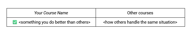
To get started, you will need to know what the most popular alternatives are in your niche.
Think:
- Books
- Podcasts
- Other courses
🙅🏻♀️ A word of caution: If you choose to make a direct comparison with another course in your niche, please be aware of the potential legal repercussions.
While specificity is king, the hassle–and the drama–might not be worth it.
3 | The Wall Of Love
After 7+ years in the online business space, my eyes tend to glaze over traditional testimonials like this:

They feel staged, overly polished, and… Well, to be honest, I just don’t want to read that much.
On the other hand, screenshot-style testimonials like this actually have a chance at grabbing my attention:

Now, I’ll admit, I still approach them with some skepticism. After all, almost anything can be faked these days (*cough cough* income claim screenshots *cough cough*).
But there is still an element of humanity and realness here that is not present in more traditional testimonial formats.
💌 While you can sprinkle these in thorough your sales page, I would also suggest creating a dedicated Wall of Love at the very end of your page (right before the final “Buy” button).
Simply stack 10+ of these screenshot-style testimonials–and voilà!
You’ve just wrapped up your sales page on a high note (and probably earned yourself a few extra sales).
BONUS: One Section To Remove From Your Online Course Sales Page
You know the “This is for you/this is not for you IF” section everyone loves to include on their course sales pages?
Most of them are… Well, terrible.
“This is not for you if you don’t want to make $20K this month” <<< No, Josh.
If you are going to keep this section around, make sure the bullet points you use actually mean something. Be as specific as possible.
Ask yourself:
What kind of person would actually get the most out of my course? And what kind of person would struggle to implement it?
💡 Some good ones include:
- This is for you if you already have a full-time employee (or a subcontractor you love to work with!)
- This is not for you if you haven’t made your first $1000 yet–a beginner course might suit you better
- This is not for you if your current season of life does not allow you to dedicate 1-2 hours a day to the implementation of this course
If you can’t get that specific? Maybe nix this section for now to avoid potential eyerolls (and lost sales).
Your Next Steps
Time to take action! Try adding one (or more!) of these sections to your existing online course sales page to see how it affects your conversions.
Remember, even the smallest tweaks can make a big difference in how your audience perceives your offer (and whether they hit the “Buy” button).
👋🏻 And if you want a little help zhuzhing up your page? Book a 60-minute Sounding Board Session with yours truly.


[…] overlook the importance of a well-designed checkout page, focusing more on “flashier” assets like their sales page or Instagram […]