


As a copywriter for course creators, I have seen far too many sales pages miss the mark because the design and copy simply aren’t working together.
In this post, I’m sharing the most common design mistakes I see people make on their sales pages–plus, practical sales page design tips to make sure your copy gets the attention (and conversions) it deserves.
Whether you’re DIY-ing your sales page, customizing a TONIC template, or working with a designer, these tips will help you create a page that’s not only beautiful… But also highly effective.
(And yes, these totally apply if you’re using a Google Doc as your sales page, too.)
5 Easy Sales Page Design Tips For Online Course Creators
Tip #1: Align your text properly
One of the most common–and easily fixable–mistakes I see course creators make when putting their copy into action?
Centering all their text like this:
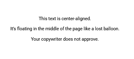
Just because the text itself is in the center of the page, doesn’t mean you need to hit the “Center Align” button, too.
Centered text creates jagged edges on both sides, making it harder for the eye to follow.
It slows down reading speed and may frustrate your audience enough to make them click away from the page.
💀 In short? It’s a readability nightmare.
To avoid this, keep your text box in the center of the page… But hit the “Left Align” button instead.
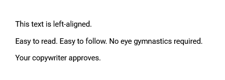
This tiny change will make your copy much easier to read and digest.
Tip #2: Keep your paragraphs short
If your copywriter didn’t do this for you (and they should have!): make sure to keep your paragraphs short and sweet.
😵💫 Nobody wants to read a wall of text like this:
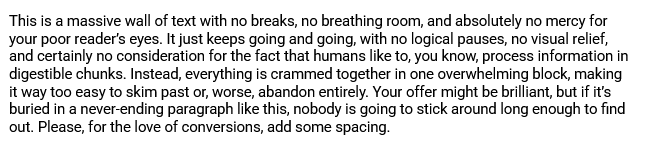
Instead, break it up into bite-sized chunks (2-3 sentences per paragraph, max).
Yes, this probably goes against everything you learned in school…
But writing a sales page is different from writing an essay for your English Lit class.
With attention spans dwindling at an alarming rate, short, snappy paragraphs are the way to go when it comes to high-converting sales pages.
Tip #3: Add some color contrast
Tell me: is this copy easy to read?

No, right?
🎨 That’s because the color contrast between the text and the background is not sufficient.
If you suspect that your current color palette might be putting you in a similar predicament, there are two things you can do:
- Use a tool like WebAim’s Color Contrast Checker to explore different color combinations yourself, or
- Book a session with a designer and ask them to help you adjust your brand colors according to the current web accessibility guidelines.
It’s a tiny tweak that can make a big difference–so try to get it sorted before your next launch if you can.
Tip #4: Add supporting visuals
If your sales page is composed entirely of text (and maaaaaybe a couple of photos from your brand shoot): we’ve got a problem, Houston.
While sprinkling in images of yourself (especially around your bio section) is a great start, you need other types of visuals to guide your audience’s attention and keep them engaged.
➡️ There are two other types of visuals you should consider adding to your sales page: mockups and icons.
Mockups
A mock-up is a visual representation of your course materials, designed to give potential buyers a tangible sense of what they’ll receive.
This could be:
- A laptop displaying your course dashboard
- A stack of beautifully designed PDF resources
- A phone + earbud combo to represent your private podcast
Including mockups on your sales page helps make your offer feel more concrete and “real”, even if everything is delivered digitally.
Icons
Icons can be a fantastic way to make your sales page more visually engaging (as well as easier to skim).
They can help draw attention to key sections–like benefit lists, module breakdowns, or bonuses–without distracting from the copy itself.
If custom icons are out of your budget, don’t worry! You can find great free options on sites like Flaticon, or explore affordable icon packs on Creative Market.
Tip #5: Make sure there’s enough white space
In the design world, “white space” (or negative space) refers to the empty areas around your website elements–like your text boxes, images, and buttons.
A good use of white space:
- Improves readability by giving your content room to breathe
- Guides your audience’s eye to the most important elements of your page
- Makes your sales page look clean, modern, and professional
Take a good look at your sales page.
💭 Does it look like the copy has enough space to breathe? Or do things look a little too squished together?
(If you’re looking for examples, this article on the importance of whitespace has some pretty good ones.)
Remember: white space isn’t wasted space. It’s a key ingredient in creating a sales page that’s both beautiful and persuasive.
Your Next Steps
From properly aligning your text to adding enough white space, implementing these tiny sales page design tips can make a big difference in your conversion rate.
That said, if your sales page isn’t converting as well as you’d like, there could be other factors at play–like your messaging, offer structure, and, yes, copy.
👋🏻 If you want some personalized advice on how to increase YOUR sales page conversions… My 60-minute Sounding Board Sessions might be right up your alley.


+ show Comments
- Hide Comments
add a comment